Color of the year for 2026 evokes calm after the storm
The color of the year for 2026 is “Cloud Dancer,” a soft billowy, ethereal white that evokes a sense of tranquility.
Pantone, the global color authority, made its much-anticipated announcement on Thursday, saying the hue “serves as a symbol of calming influence in a frenetic society rediscovering the value of measured consideration and quiet reflection.”
According to Pantone experts, “Cloud Dancer signifies our desire for a fresh start.”
“We are living in a transitional time where people are seeking truth, possibility and a new way of living,” said Laurie Pressman, vice president of Pantone Color Institute. “Cloud Dancer is an airy white hue that exemplifies our search for balance between our digital future and our primal need for human connection, a liminal space that is a launchpad for creative expression, as individuals and communities are experimenting beyond traditional boundaries, opening the door to increased imagination and innovation.”
To arrive at its annual decision on the hue of the New Year, a practice it first started in 1999, Pantone’s color team study both macro and micro trends in fashion, art, travel, consumer products, social media, technology and other influences around the world that best encapsulate and reflect the prevailing mood of society.
In some years, it was more than one color. Pantone picked two colors for 2016: baby blue and dusty pink, describing them as “welcoming colors that fulfill our yearning for reassurance and security.”
2021 was also a year of two colors: “Ultimate Gray” and “Illuminating” (a shade of yellow).
Once the color of the year is declared, brands rush to produce all kinds of products — clothing, footwear, makeup, jewelry, luggage, home decor and furnishings and houseware in that shade.
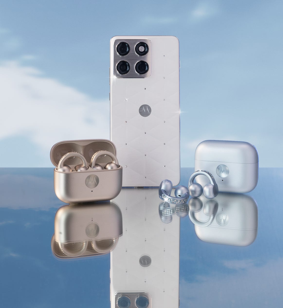
Pantone gave a peek into brands that are ready with Cloud Dancer offerings in 2026. They include a Motorola special edition phone, a new Play-Doh product in the “Cloud Dancer” hue and even a new Post-It Notes collection in shade “Cloud Dancer.”
Johanna Constantinou, an interior trends expert with UK-based Tapi Carpets & Floors, called Cloud Dancer “one of Pantone’s most surprising Color of the Year choices to date.”
“At a time when many expected richer, moodier hues, Cloud Dancer instead signals a shift toward clarity, calm and quiet refinement,” Constantinou said. “This unexpected choice suggests a countertrend emerging alongside maximalism: spaces that prioritize rest, lightness and breathing room.”
At home, she said the color can be paired with warm neutrals, soft grays, muted greens, dusty blues, blush pinks or light terracotta.
“Cloud Dancer’s strength lies in its ability to sit quietly at the heart of a variety of distinct moods, from soft and dreamy to vibrant and unexpected,” she said.
Related:


